
Reading a Chart
Lesson three

Introduction
Welcome to lesson three. We’re going to spend this lesson learning how to actually read a chart. Whatever you do, DO NOT SKIP THIS LESSON. And consider re-reading it over and over again until you really understand this stuff.
1. What a Chart Actually Is (And Isn't)
Before we touch a candle, we need to simply understand what a chart is. A chart is a record. It tells you the price something traded at over some window of time. That’s it.
What a chart is NOT: a prediction machine. The candles on the screen do not know what comes next.
So why look at charts at all? Because charts show you where buyers and sellers fought, where they showed up in size, and who won. That information has real value. People remember the price they bought at. They remember the price they sold at. Those memories cluster, and they show up again when price returns to those levels. Reading a chart well is reading those clusters of memory and behavior, looking for patterns, analyzing how investors will react based on price action, but not divining the future.
Frame the rest of this lesson around that. We are not learning magic. We are learning to read price action and behavior.
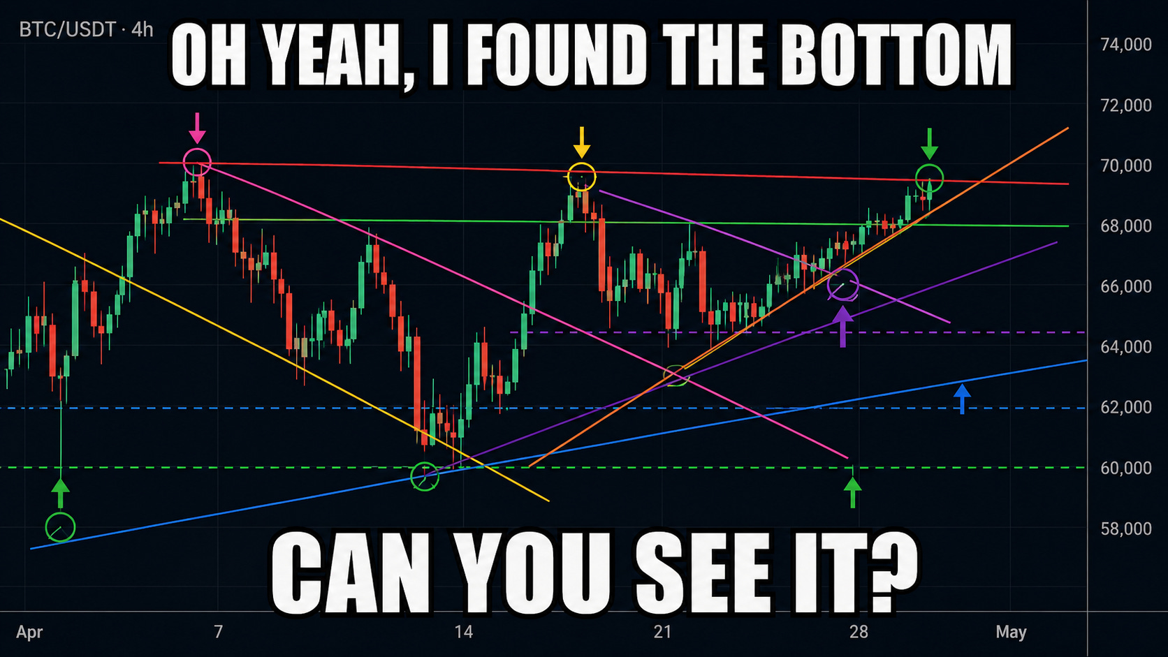
A quick word on chart patterns before we move on. There are entire books, courses, and YouTube channels devoted to them. Head and shoulders. Cup and handle. Triangles. Flags. Pennants. Wedges. Diamonds. The list goes on forever.
A lot of it is reading tea leaves. Your brain is wired to find shapes in noise, and a chart is basically infinite noise. If you stare at any chart long enough, you WILL find a “pattern.” That doesn’t mean it means anything.
But here’s the more interesting part. Chart patterns can also work for a much simpler reason: everyone is reading them. If thousands of traders all see the same “bull flag” forming, they all start placing orders around the same level, and that itself moves the price. It’s a kind of just mass manifestation. The pattern works because the pattern is being watched, not because the lines themselves had any predictive power.
And then there’s a third category, the patterns that actually reflect something real. Real investor psychology. Real money flow. Real shifts in who is in control of price. Those patterns aren’t magic, they’re behavior, and you can almost see the reason they work as you watch them form. Even those, though, can be invalidated in a single bar. A clean setup with a perfect chart can fail the next morning on bad news, a bad print, or a regime change. There is no pattern in the world that is “guaranteed.”
There are entire books out there that walk through every named chart pattern in detail. We are not going to cover them in this course but maybe one day.
2. How to Read a Candlestick
This is the most important section in the module. If you only learn one thing here, learn this. A candlestick contains a huge amount of information per bar if you know how to read it, and most retail traders look at thousands of them without ever really reading any of them.
Anatomy of a candle
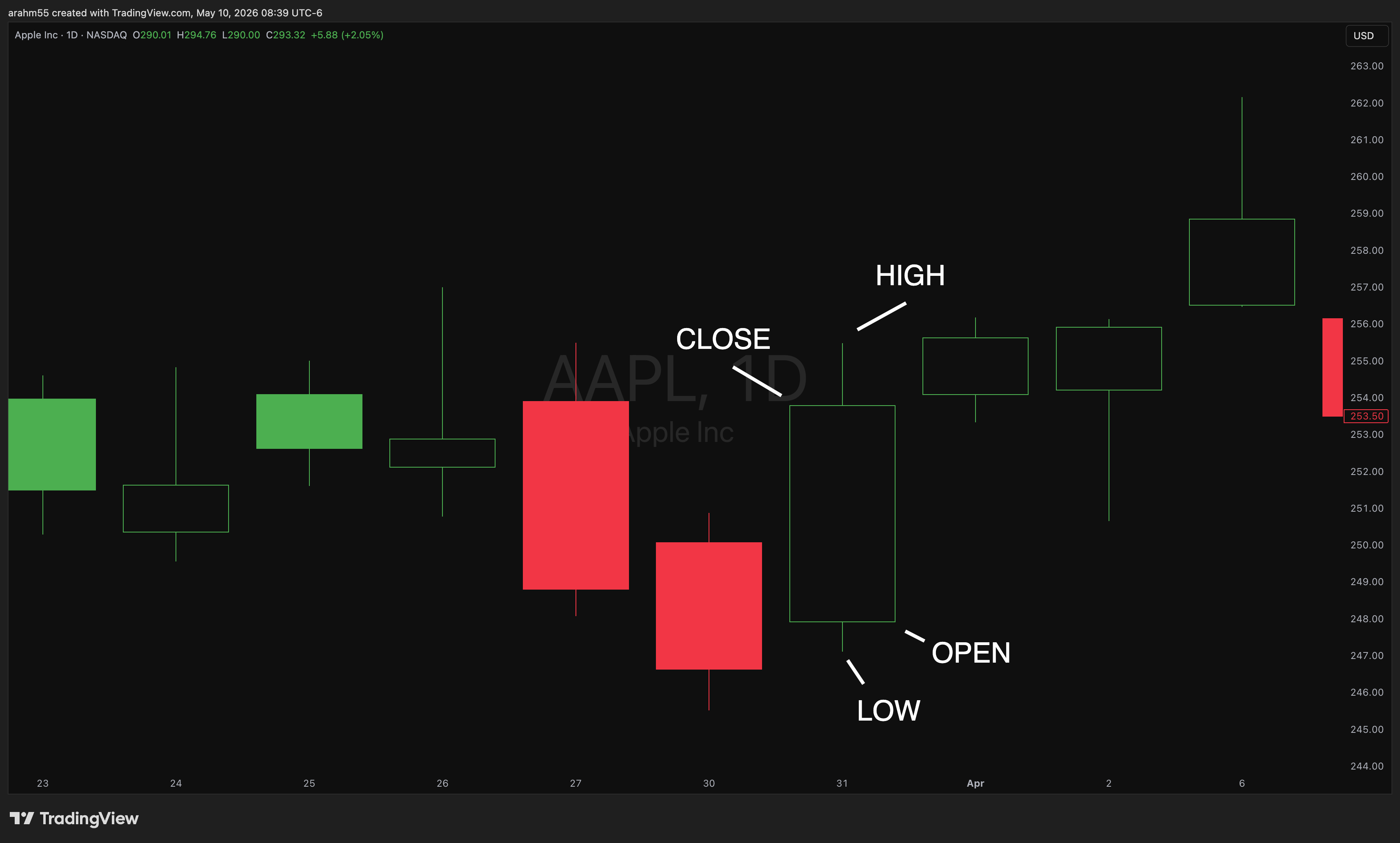
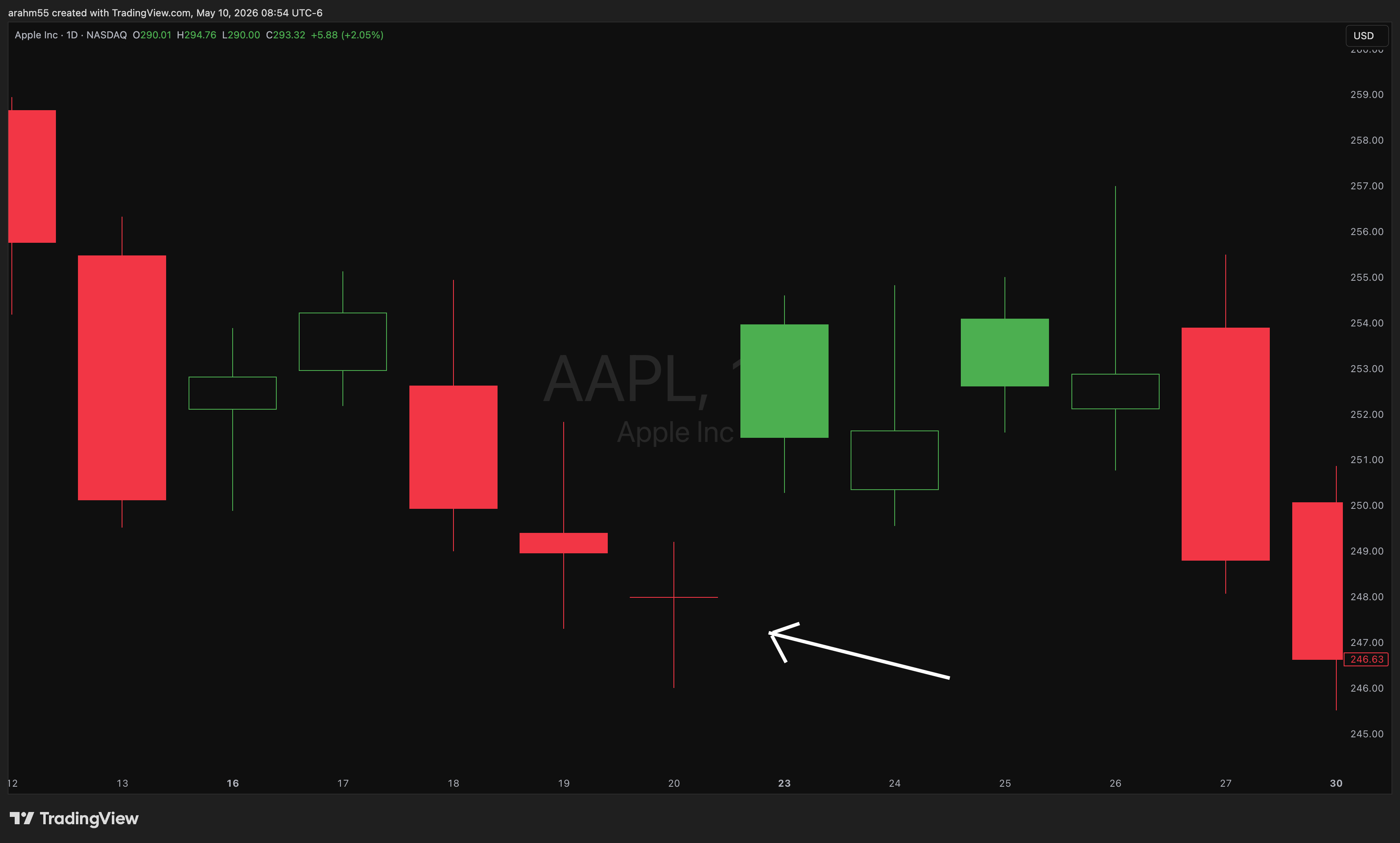
Every candle represents a fixed period of time (a minute, an hour, a day, etc.). It encodes four numbers: the OPEN (the price when the bar started), the HIGH (the highest price reached during the bar), the LOW (the lowest price reached during the bar), and the CLOSE (the price when the bar ended). The “body” is the rectangle between the open and close. The “wicks” (also called shadows) are the thin lines sticking out the top and bottom, showing the high and low.
That’s it. Four numbers, one shape. And the shape matters.
What the body tells you
A long body means the price moved decisively in one direction during the bar. Buyers (or sellers) were in control from start to finish. A small body means the open and close were close together, meaning the bar was a wash, neither side won. Long body equals conviction. Small body equals indecision.
What the wicks tell you
Wicks are important. A long upper wick means price tried to go up during the bar but got slapped back down by sellers before the close. A long lower wick means price tried to fall but buyers stepped in and pushed it back up. Both long wicks on the same candle (a wide range with a small body) mean chop. The fight happened, but neither side won.
Color matters less than you think. Most traders see a green candle and think “bullish, good.” That’s lazy reading. A green candle with a giant upper wick is actually a BEARISH bar, sellers showed up at the highs and forced price back down before the close. A red candle with a giant lower wick is BULLISH, buyers absorbed the selling and lifted price back up. Read the shape, not just the color.
Hollow vs filled candlesticks (a setting most beginners ignore, but it’s gold)
Standard candlestick charts only encode direction. Green for up on the day, red for down on the day. Hollow candlesticks encode TWO pieces of information per bar, and once you turn them on you can’t go back.
Here’s how it works. Color (green or red) compares the current close to the PRIOR close. Hollow vs filled compares the current close to the CURRENT bar’s open.
That gives you four possible candles:
Hollow green. Gapped up from yesterday AND closed higher than this bar’s open. Strongest bullish candle. Opened strong, kept buying all session.
Filled green. Gapped up from yesterday but closed below this bar’s open. Mixed signal. The gap held, but sellers showed up intraday and gave some of it back.
Hollow red. Gapped down from yesterday but closed above this bar’s open. Mixed signal in the other direction. Red on the day, but buyers fought back from the lows. Often the first sign of a bottom forming.
Filled red. Gapped down AND closed lower than this bar’s open. Strongest bearish candle. Opened weak, kept selling.
Why this matters: hollow candles let you read intraday character and gap behavior at a glance. A string of filled green candles in an uptrend is a quiet warning. The market is still green, but the buyers are losing their grip inside each bar. That kind of subtle weakness almost never shows up on a regular chart.
Most platforms have hollow candles as a one-click setting. ThinkorSwim, TradingView, Active Trader Pro, all support it. Turn it on. You will see things you weren’t seeing before.
A few candle shapes worth knowing by name. I’m not going to dump 50 named patterns on you. Books have been written about that. But these four are worth being able to recognize on sight, because they show up at meaningful moments:
Doji
Open and close at almost the same price, big wicks on both sides. Pure indecision. Often shows up at turning points after a strong move.
Hammer
Small body at the top of the candle, long lower wick. Buyers got dragged down hard, then violently reversed. Bullish when it shows up at a low.
Shooting star
Mirror image of a hammer. Small body at the bottom, long upper wick. Sellers crushed a rally. Bearish when it shows up at a high.
You don’t trade these in isolation. You use them to confirm a thesis you already had from price, volume, and context.
Reading sequences. One candle is a data point. Three or four candles in a row tell you a story. A series of small green candles with shrinking volume after a big run is a tired uptrend. A red bar followed by a sharp green bar with a long lower wick is a fight that the buyers won. Don’t read candles one at a time. Read them like sentences.
The thing nobody tells beginners. Every candle on your screen is just a smaller bar on a different timeframe, smashed together. A daily candle is 78 five-minute candles compressed into one shape. An hourly candle is 12 of them. Internalize that, and timeframes are going to make a lot more sense in the next section.
3. Timeframes
Same chart, three different stories, depending on which timeframe you’re looking at. This is the single most common way retail traders fool themselves. They zoom into a 5-minute chart, see a perfect breakout, take the trade, and then get confused when it fails because the daily chart is in a clear downtrend. Or they look at the daily, see a beautiful setup, take the trade, and watch it bleed all afternoon because the 5-minute is doing something completely different.
The big three timeframes I actually use:
Weekly
This is the overarching trend or theme. I don’t hold most trades long enough to only rely on weekly candles, but they’re incredibly important to understand long term direction.
Daily
This is the structural view. It tells you the regime, the trend, the major levels. If you only have time to look at one timeframe, this is the one.
Hourly
This is the swing view. It tells you what’s happening within the daily bar. Pullbacks, intraday levels, where momentum is shifting.
5-minute
This is the execution view. Use it for timing entries and exits, not for forming the thesis. If you build a thesis on the 5-minute, you’ll get whipsawed every day of your life.
The rule that matters: you build the thesis on the higher timeframe and you execute on the lower timeframe. Daily tells you what to trade. Hourly tells you when to look. Five-minute tells you when to pull the trigger.
When the timeframes disagree, you don’t have a trade. A daily breakout with a 5-minute that’s already overextended is a setup that’s about to slap you in the face. Wait for alignment, or move on.
And one warning: DO NOT pick a timeframe to fit your bias. If you find yourself flipping from the daily to the 4-hour to the 1-hour looking for a reason your trade was right, stop. That isn’t analysis, that is you arguing with the market. The market doesn’t care.
4. Volume
Almost every indicator on your chart is a math function applied to past prices. Moving averages, RSI, MACD, all of them are derivatives. They tell you what already happened, slightly later. Volume is different. Volume is real-time information about how many shares (or contracts) actually traded during a bar.
The big idea: volume is conviction. A 2% move on huge volume means real money traded at those prices, real positions changed hands. A 2% move on tiny volume is a few orders pushing thin liquidity around. Same chart, very different information.
Two flavors of volume:
Absolute volume. The raw number of shares/dollars that traded. Useful for comparing across stocks (SPY trades way more than some random small cap, that’s just liquidity).
Relative volume. Today’s volume compared to the recent average. This is the one that matters for trading decisions. If a stock normally trades 5 million shares a day and it’s already at 15 million by lunch, something is happening.
The most useful application: confirming or rejecting “breakouts.” A breakout above resistance on heavy volume is real. The same breakout on average or below-average volume is almost always a fakeout. Big institutions don’t sneak. When they’re buying, you see it in the tape.
The rule I use: if a move is real, the volume is there. If the volume isn’t there, the move isn’t real, no matter how clean the chart looks.
5. Support and Resistance (The Most Magic Lines)
The one concept from the chart pattern world that matters more than any other, that I use every single day, and that has real, mechanical reasons to work, is support and resistance.
Support and resistance are memory zones. A support level is a price where buyers showed up before. A resistance level is a price where sellers showed up before. The reason these levels matter is not magic and not technical wizardry. It is that humans remember prices. Someone bought at $60 and watched it drop. When it gets back to $60, they want to sell to “get out at breakeven.” Someone shorted at $100 and watched it rally. When it gets back to $100, they want to short again. Stops cluster at the same levels. Limit orders cluster at the same levels. The behavior repeats because the big money players haven’t changed.
Support and resistance are zones, not lines
This is the mistake every beginner makes. They draw a single pixel-thin line at $97.43 and treat it like a sacred barrier. It isn’t. The level is a zone. $97 to $98 is a zone. $100 (a round number that everyone watches) is a zone, maybe $99 to $101. The market is messy. Treat S/R as a region of interest, not a precise number. In drawing terms, it’s a box not a line.
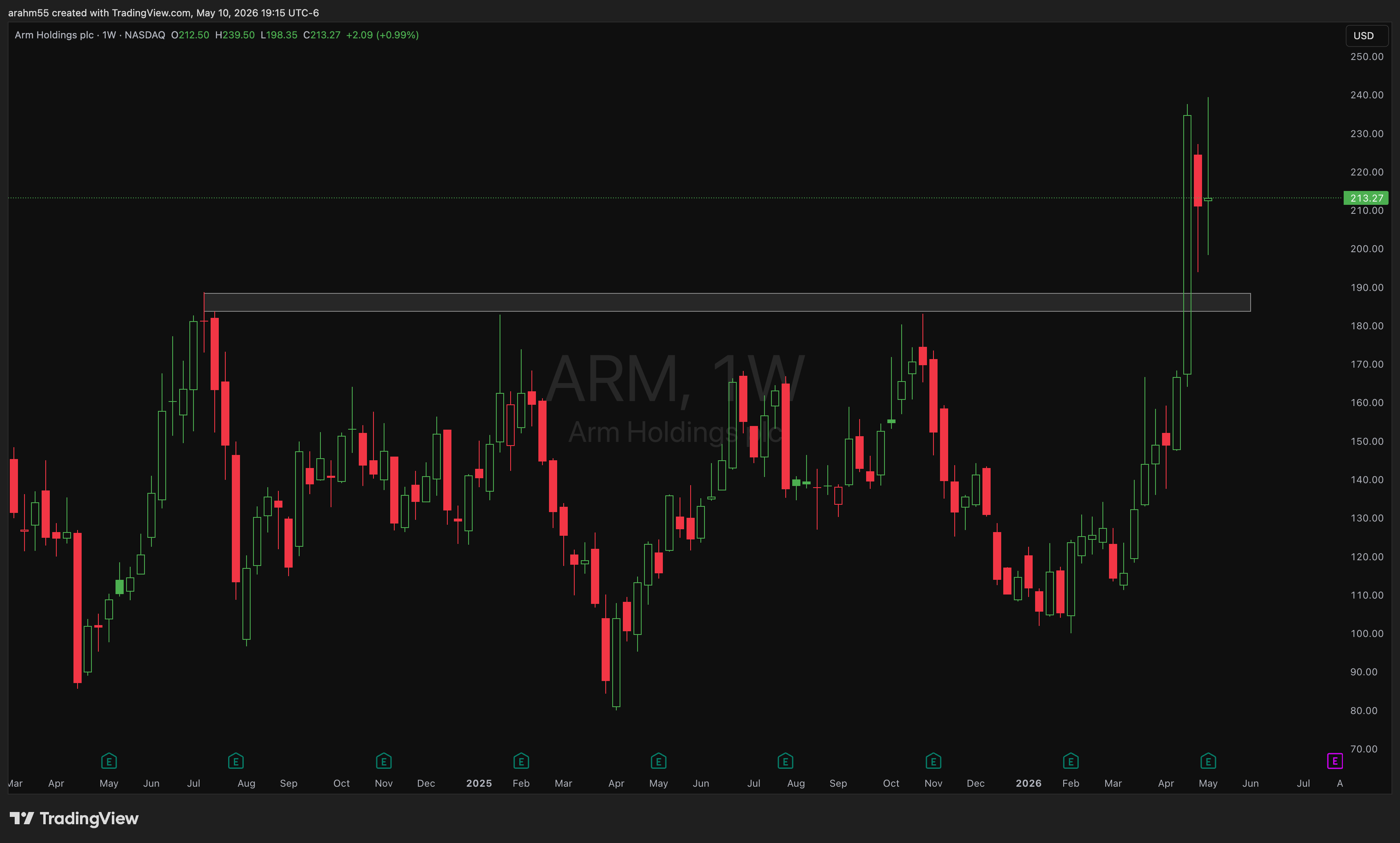
Resistance flips to support, and vice versa
(in the chart above, the white box is initially a heavy line of resistance, and the green box shows that it flipped to become support)
When a level breaks and price closes meaningfully through it, the people who were defending it are now wrong. The sellers at $35 resistance are now offside. The next time price comes back to $35, those same sellers are looking to bail at breakeven, which means they become buyers. Resistance, once broken, becomes support. The same thing works in reverse on the way down.
This is one of the few S/R behaviors I’d call high probability. A level that breaks, retests from the other side, and holds is a textbook continuation setup.
A real example from my own trades
In late September 2025, I bought call spreads on TGT (Target). Here was the setup. TGT was trading back at 2019 levels, around $88 a share. That isn’t a random number. $85-90 was a zone where the stock had bottomed multiple times years prior. Multi-year support. The kind of level where, even if the company is going through a rough patch, real institutional buyers tend to step in because the level has held under far worse conditions than what the company was facing today.
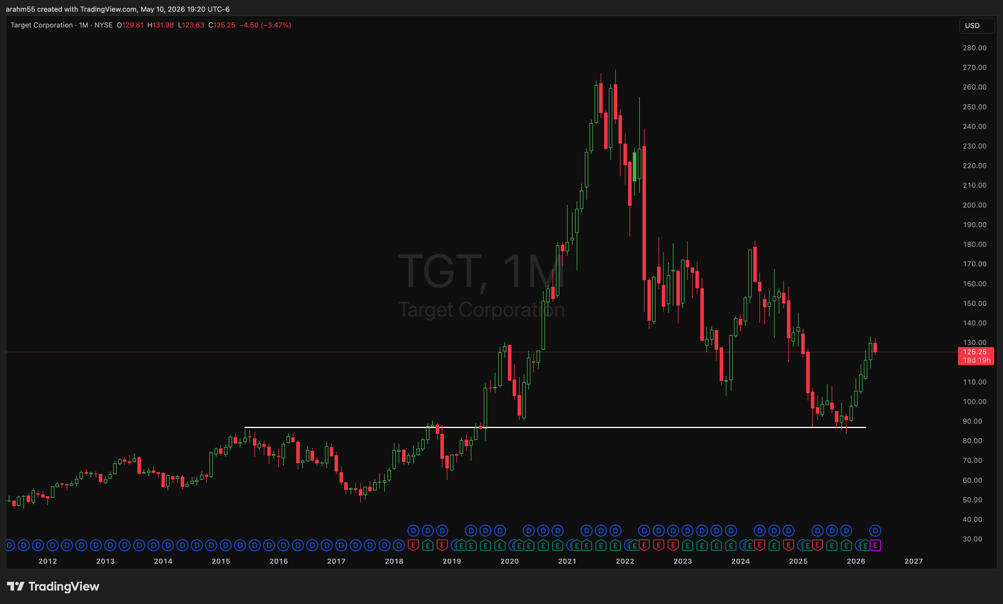
So I bet on the level. I sized the trade around the assumption that $85-90 holds and the stock has formed a bottom. The whole thesis was: the company is fine, the stock is at a multi-year memory zone, and the people who bought it down there before are going to defend it again.
That is all a support trade is. You aren’t predicting anything mystical. You are betting that the people who showed up at this level before will show up at it again, and you size the trade so that if you’re wrong, the loss is contained.
The biggest trap
You can find “support” anywhere if you draw enough lines. But the cleanest S/R levels are the ones that almost everyone is looking at. Multi-year highs and lows. Round numbers. Prior consolidation zones. Big gap fills. If you have to squint to see your level, it isn’t a level. The whole reason S/R works is that lots of people are watching the same price. If you’re the only one looking at $73.41, nobody else is going to defend it, and it doesn’t matter.
6. RSI: A Great Indicator
I told you a minute ago that I’m skeptical of indicators. I am. Most of them are noise dressed up in math. But there are a couple worth the time to learn. RSI is one of them.
What it is
RSI stands for Relative Strength Index. It’s a momentum oscillator. It takes recent up moves and recent down moves over a window (default 14 bars) and produces a single number between 0 and 100. High RSI means the recent action has been disproportionately to the upside. Low RSI means the opposite.
The standard reading (and why it’s a trap on its own)
Every retail trading book will tell you that an RSI above 70 means “overbought” and below 30 means “oversold.” The implied trade is: short overbought, buy oversold. This sounds great. It also doesn’t work.
The problem is that strong trends spend WEEKS in overbought or oversold territory. NVDA in 2024 was overbought on a daily RSI basis for months. If you shorted every time RSI hit 70 you would have been carried out on a stretcher. Same thing in reverse during a serious sell-off. “Oversold” can stay oversold for a long time.
If you only learn one thing about RSI, learn that “overbought” doesn’t mean it’s going down and “oversold” doesn’t mean it’s going up. Those words describe momentum, not destination.
Where RSI actually earns its keep: divergence
RSI is most useful when it disagrees with price. Specifically:
Bearish divergence. Price makes a higher high, but RSI makes a lower high. The new price high happened with weaker momentum than the previous one. Buyers are getting tired even though the chart still looks bullish. This is one of the few legitimate early warnings you can read off a chart.
Bullish divergence. Price makes a lower low, but RSI makes a higher low. The new price low happened with less downside force than the last one. Sellers are running out of ammunition even though the chart still looks ugly.
Divergences don’t tell you exactly when. They tell you that under the surface, the trend is losing steam. They are confirmation tools, not entry signals on their own.
How I actually use it
I treat RSI as a second opinion, not a trigger. If I have a setup based on price, volume, and S/R, and RSI confirms (or, even better, shows divergence in my favor), I have more confidence to take the trade. If RSI strongly disagrees with my setup, that’s a yellow flag. I don’t blindly listen to it, but I don’t ignore it either.
One last note on settings: leave RSI on the default 14-period setting. Tuning it does not make it better. It just makes it more curve-fit to the past. The reason it works at all is that lots of people are using the same default. Don’t try to be cute or different.
7. Moving Averages: Lines That Actually Matter
The other indicator I’ll keep on my chart. Moving averages.
What it is
A simple moving average (SMA) is exactly what it sounds like. Take the closing prices of the last N bars, average them, plot the result as a line. A 200-day moving average is the average closing price of the last 200 trading days, plotted underneath today’s price. Slide the window forward each day, get a new point, draw the line.
That’s the whole math. It’s a smoothed-out version of where price has been.
The 200-day. The only line I really care about
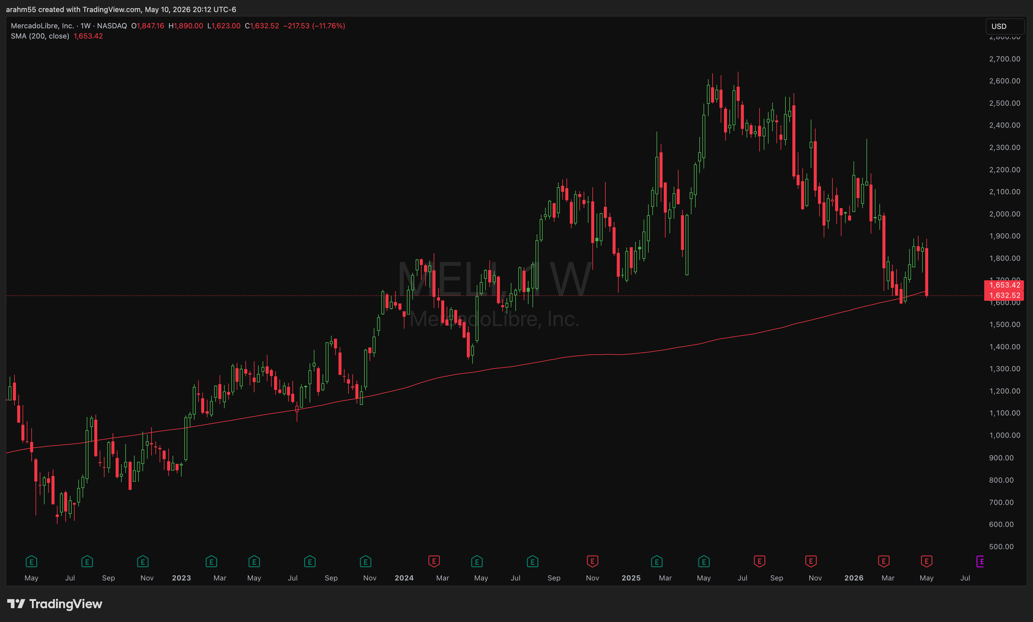
If I had to delete every line on my chart and keep one, it’s the 200-day moving average. Not because the math is special, but because of who’s looking at it. The 200-day is the line every institution, every analyst, every fund manager, and every algo on Wall Street is watching. When financial news talks about a stock or index being “above the 200” or “losing the 200,” that’s what they mean. CNBC mentions it constantly. That alone makes it self-fulfilling.
Mechanically, the 200-day separates two regimes. Above it, the trend is broadly up and dip-buyers tend to show up. Below it, the trend is broadly down and rallies tend to get sold. It is the cleanest single line you can draw to answer the question “is this stock in a bull or bear regime right now?”
When price is trading well above the 200, the bias is up. When it’s trading well below it, the bias is down. When it’s hovering at the line, that’s a fight, and the outcome of that fight tends to set the tone for months. A clean reclaim of the 200 after being below it is a regime change. A clean break below it after living above it is a regime change in the other direction.
I’m not saying you blindly buy every touch of the 200 or short every break of it. I’m saying that if you’re long a stock that just lost its 200-day, you should know about it, and you should have a good reason for staying in.
The other ones I keep on the chart
I also like having the 21 and 50-day on my chart, but they’re secondary.
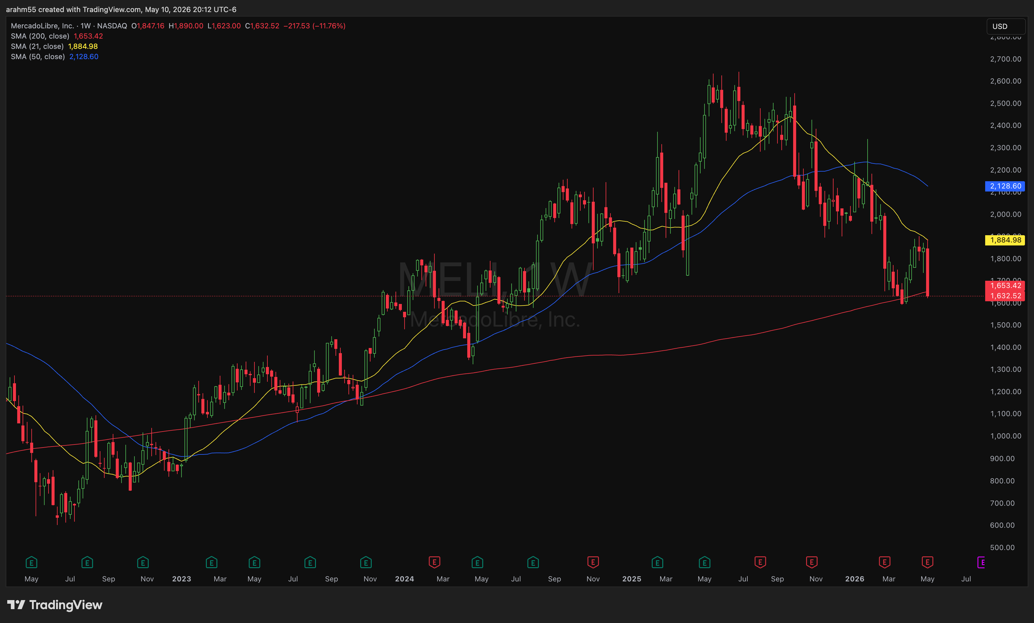
The 21-day is short-term momentum. In a healthy uptrend, price tends to ride on or just above the 21. When price loses the 21 cleanly, the short-term momentum has shifted, even if the broader trend is still intact.
The 50-day is medium-term. It’s the line a lot of swing traders watch, and a lot of trend-following systems use some version of it. In a strong trend, the 50 is often the second-tier support level, the place where institutional buyers step in if the 21 doesn’t hold.
Together you get a layered view. The 21 tells you about the last few weeks. The 50 tells you about the last couple of months. The 200 tells you about the whole regime. When all three are stacked in the right order with price above them, you have a stock in a clean uptrend. When they’re stacked the opposite way with price below them, you have one in a clean downtrend. When they’re tangled up and crossing each other, the stock has no trend, and you should probably leave it alone.
How I actually use them
Same way I use RSI. Second opinion, not a trigger. If I’m thinking about getting long a stock that’s trading below its 200-day, I have to be honest with myself about why I’m fighting the trend. If a setup lines up with the 200 also acting as nearby support, that’s a tailwind. If price just reclaimed the 200 on volume, that’s worth paying attention to.
The 200 isn’t going to tell you when to enter a trade. It’s going to tell you what side of the field you’re playing on.
What You Should Know After Lesson Three
What a chart actually is and what it isn’t
How to read a candlestick all the way down to the wick, including hollow candles
How to use multiple timeframes without contradicting yourself, and why thesis lives on the higher timeframe and execution lives on the lower one
Why volume is the only indicator on your chart that isn’t lagging, and how to use it to separate real moves from fakeouts
What support and resistance actually are, why they work, and how to use them without drawing 20 imaginary lines
What RSI is, why naive overbought/oversold trading is a great way to lose money, and how divergence is the actually-useful signal
Why the 200-day moving average is a line you can’t ignore, and what the 21 and 50 add on top of it